Image may be NSFW.
Clik here to view.
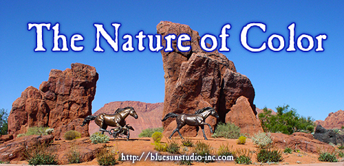
Nature inspires art in so many ways. Whether we experience a Sedona or Maui sunset in person or see a stunning image while surfing the net, landscapes, animals, plants and the rest of the world around us shape the projects we create. I got a good dose of color this weekend when I took a trip to St. George, Utah with my parents for my Dad’s 75th birthday.
One question we ask our clients during our project discovery consultations is what colors do you like? That’s a broad subject and often times, it’s one of the hardest for a client to answer. Single colors like red, orange, green or yellow come to mind, but colors are so varied, trying to name just one or two is enough to make your head spin.
You have warm and cool colors, you have shades and tones. You have colors that are opposites and will make your eyes wonky just looking at them together. You have some colors that make other colors look totally different when used next to each other. Whole courses have been taught on color theory and some artists spend lifetimes devoting themselves to the use of color.
Today Wendi and I took a look at our own color pallets across all four of our sites—and both of us came up with the same response: ICK! The samplings of color we got we wouldn’t have suggested to a client, so why did we have it? Since our main goal right now is bringing EVERYTHING together, we decided we had to come up with a pallet we could use across all the sites in some shape or form…and what we have now isn’t it.
What were we missing when we created each of our Blue Sun Network sites?
The whole picture. Literally. Sites were added on over the years and, I’m ashamed to admit, we didn’t stop to consider how they looked together overall. Like with the covers we did for our novels, there has to be something that ties them all together, a common thread.
You’ll be using more than one color to make up the complete design. Just like a photograph or painting, it takes a palette to make a picture. What do you want your site to say? If you’re a foodie site, red and yellow may be for you. Studies have shown red and yellow stimulate the appetite. I know when I see certain shades of yellow and red, I instantly think mustard and ketchup, and from there it’s a short leap to McDonalds. Cravings for cheeseburgers aren’t too far behind after that.
If you have a site that requires tranquility, you think of blues and purples. When you think of growth, you think of green.
Some colors you want to use as your primary color throughout the site, like in the banner and for a background. Others, usually the really bright, eye-catching ones, you want to use as accent colors that highlight your links or draw attention to specific areas of your site.
How do we, as your designers, do this?
We use something called a color palette. With so many color choices out there, we know how difficult it is to choose. We’ll often refer clients to our Pinterest page or go directly to Seeds for inspiration. Seeing a selection of images helps you visualize your choices better than trying to pull it out of your head and put it into ours.
How A Color Palette Works
When working with colors on the web, designers use something called a Hex Code. It looks like this: #E2E2E2. This is a number given to every color, which the computer reads to create it.
If you’re a designer, Firefox and Chrome browsers have a nifty little plugin called Collorzilla. Not a designer? Get it anyway. This will help you communicate with your designer better. The way it works is you install it on your browser, then use the little eyedropper icon to select the color you want from the webpage. A little crosshair will show up, replacing your cursor, and then you hover over the color you want and click. That saves that pixel of color and gives you a hex number you can then use in Photoshop or give to your designer for an exact match.
How to Make a Color Palette
When you have a program like Photoshop, creating color palette is easy. You take a photograph, then use Photoshop’s eyedropper tool or Colorzilla to make an image with blocks of color like you see on Seeds. Pulling colors from a photo enables you to automatically have a family of colors that already go together.
But what if you’re not a ‘Shop Junkie? Even for me, creating a palette from scratch is time consuming. Fun, yes, but we’re all busy people and pulling colors can be tedious work. In that case, you use a tool called a Color Palette Generator. DeGrave has an excellent one. Simply upload your photo and click the generator button.
Et voilá! You have an instant color palette to work from!
Take a look at your current site or design project. How are your colors working for you? Are they enhancing your overall message or hindering it?